When it comes to techwear, Errolson Hugh and his ACRONYM label have carved out a nice little space at the upper escalon of where function, fashion and form prove to be part of a greater esoteric narrative and a way of life.
A masterful craftsman based in Berlin by way of Canada, Hugh is in a league of his own in the growing market of high tech garments. Instead of releasing a complete collection of styles, and something for everyone, Hugh is more about perfecting just a handful of goods for a specific audience, an ever-growing niche audience of cult followers that are perfectly happy with rare art of craftsmanship and meticulous attention to detail.
Think of ACRONYM as that impenetrable exoskeleton where the understated simplicity and design of traditional martial arts garb meets the utilitarianism and future-focused function that gives you everything you need to fight your way through the apocalypse.
Since Day One, ACRONYM has been a grand vision with limited output, and very much a small operation complete with huge successes. Founded in 1994, the label releases a handful of products each season, most of which sell through quickly with no advertising, no runway shows, no hyped release dates. Those who know, know. Those who don’t aren’t missed. Hugh himself can be found modeling his creations on the site. Not as an ego thing, but more as if he’s giving his own approval, and maybe suggesting his team is so small that hiring outside models would be excessive.
To give you an example of what separates ACRONYM from the rest, you need look no further than his tech specs for each item. Their names are industrial sounding, like V26-A. And every letter and number mean something specific. His website is at once one of the most informative and confounding out there. Each item reads poetic descriptions of math and science with a touch of history.
If Gore-Tex is where your knowledge of tech wear begins and ends, don’t worry, he uses plenty of it, but for Errolson, that’s almost as elementary as it gets. In the end, it’s most probable that you’ve never heard of 90% of the technological and experimental fabrics used from piece to piece. You’ll see a lot of TM’s and s of little known special touches that few other brands use, let alone have ever heard of. In the end, you’re left with someone who pushes the boundaries of textiles, and since you’ll never come in contact with these things elsewhere, you’ll just have to trust that it’s the best fabric for that specific creation at that specific time. “Up to 28% more breathability,” one product states. How can you even arrive at a statistic like that?
ACRONYM is known for it’s utilitarian designs and pieces that fit together with other products in their line as a “system.” Each article goes through rigorous trial and error and in-the-field testing until it is decided to be released. And even then, it sometimes happens where certain items have been further updated and re released to be even better.
If it’s color you’re looking for, look elsewhere. Monochromatic rules for Hugh. If you’re looking for flair, it’s in there, most likely in the way of a pocket or useful construction, but all in all an overall understated look.
Ladies and Gents, Mr. Errolson Hugh.
Errolson Hugh on a Zoom call with Bodega
Ok, so tell me about this recent laptop collaboration with Asus. How did that come to be? Given your attention to detail and quest for quality, it’s obvious you’re not going to just put your name on anything. What drew you to this? Are you a gamer?
Asus’ Republic of Gamers approached us at Hypefest and they had us in mind for this and when we heard more about it we thought, “absolutely.”
ACRONYM, it’s clothes, it’s fashion, it’s streetwear, it’s whatever... but when we design, we were trying to design from the perspective of it as a tool or an interface of your environment. The extension from that to a laptop or a phone is actually not that big conceptually, so we thought we could do it. We’ve had ideas in the past about that kind of stuff just from conversations, so it was great that we were able to realize some of those. In the end it was pretty organic.
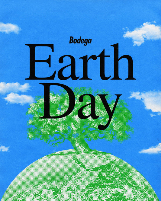
Product Ad by Bodega
R O G ZEPHYRUS G14-ACRNM
What were your first instincts when you approached this project? Was there a story you wanted to tell? Just to give the people at home some background, your design incorporates TWO new fonts as well as some intriguing, esoteric etchings. What was the purpose behind some the accents you included?
Neither the Republic of Gamers, nor any of us at ACRONYM had ever done a collaboration like this before. So the real work was just trying to understand each other and what actually goes into making a laptop. Everything from the silicone side, how long is the chip set, how does the configuration work, more RAM and less RAM, what does it mean? And of course the manufacturing because it’s such a competitive space and the processors in particular are so precisely timed because they’re improving all the time. So immediately there were all of these time constraints and all of these windows that were clearly defined before we even got started. We had to understand what we could actually change and what was possible. It was a lot of back and forth. Can we etch it? Can we change the color? What happens if we do this? I don’t know how many prototypes we made. There was a constant stream of FedEx boxes from Taiwan. We’d open them up and find all these weird parts. We almost never saw the whole machine at once.
Obviously one of our main partners when doing this was David Rudnick, who is the reason we are able to do two typefaces that are custom to the machine. Because it would take normal human beings take months and months to make something like that. It’s very over the top. David is the kind of guy who can make a new typeface on a longhaul flight by just putting his headphones on and doing his thing. Obviously we wanted to take advantage of that and his skillset. Really we tried to address every single detail that we could, and if they let us try it, then we tried it. We just wanted to go as hard as we possibly could, and for better or worse that’s where we ended up.
It seems like the colors on the keyboard may be the furthest you’ve gone into using colors in any of your designs. Would you agree with that?
Well, yeah, [laughs] aside from the Nike sneakers. It’s definitely it’s own thing. That actually came out of a lot of research and a lot of looking at keyboards and tools from different types of devices. We wanted to evoke the idea of the functionality of the machine and have people see the machine not just as a window into another space, but the physical reality of the tool itself is one that should be present. So we started looking at things like editing suites and trading terminals and really, really specialized hardware. Those design cues informed the decision for the colors of the keyboard and the placement of them. But we also wanted to show that the main design element wasn’t to show off to people outside. The design is for the people using this machine. The thing is largely matte black on the outside, but when you open it, you get this surprise of the insane color palette. But then again, it’s only you who sees it. It’s meant to feel like this is your space, you’re the one who is the primary importance and you’re they’re to make your shit or do your work or whatever. That was it.
In the brief time that I saw it, I noticed that there was a silhouette of your face. It was both familiar and ominous. I was curious about your choice to include that.
It’s funny; we kind of stuck that in as an extra. We had done a whole bunch of other patterns as well to play around with the matrix on the back of the machine. That one was kind of the throw away where at the last second we said, “yeah why not.” For whatever reason, every journalist and every photographer picks that one to highlight.
I think we may have miscalculated that aspect of it. The laptop itself is only half of the experience. The way the laptop is set up is sort of a gateway into a media experience and a narrative. That graphic ties into that. Without giving anything away, it wasn’t just my ego. There’s a bigger story behind it and there are some levels to that will hopefully be revealed over time.
Prior to this you’ve been asked to make outfits for characters in video games. Was that an odd project for you? Or did you find it to make total sense since your clothing line is already set on making the most resilient, durable and tactical clothing for real life. A video game character on the frontlines, under constant attack may actually be your target audience.
Yes, that makes sense. [Laughs] This is actually the third video game project that we’ve done. Like you mentioned, we’ve designed clothes for characters in games. Funny enough, when we did clothing for Deus-Ex and Death Stranding, we actually ended up designing the clothes as if they were real. We used the exact same process as we would for something we would actually manufacture. It just translates super easily. People have asked why we get these requests and I think it’s because when we’re designing ACRONYM we have a narrative world in mind and clothes are part of that world. In that way, the narrative is told through the clothing and other times it happens to be a movie or a videogame or whatever. Everybody in the videogame world understands that immediately, even if they don’t consciously understand it right away. I think a lot of that comes from me growing up in the middle of nowhere in Canada before the internet. I didn’t have a lot of access to fashion. It was definitely more films and television. All of that stuff informed my design process on a super deep subconscious level. That’s probably where that comes from.
How hand-in-hand do you work with the manufacturers of these technological products, and how well versed are you in the science of it all? Do fabrics companies come to you? Do you search things out? How hands-on of an experience is that part of the process for you?
Because of the types of materials that we use, it’s a very, very small number of suppliers that can make the materials to the specifications that we need as ACRONYM because they need to look cool, and they need to work And to the degree we need or want that in our stuff narrows down the manufacturers immediately. By now we know them quite well and they know us, so a lot of the times they will tell us, “Hey, heads up, we’re working on this thing.” Some of them, like with W.L. Gore & Associates, we’ll do in-depth seeding garments and R&D stuff for them. Stuff that may not even be able to be a material, but we’ll take a look at it and we’ll make them a prototype or do a study with them. We have a little input on that level, but fundamentally it’s a different industry. It’s a science all by itself, and it’s extremely advanced. It’s not realistic for any apparel brand to engage in fabric development on that level, and of those types of fabrics from scratch. It’s just not a realistic thing. It’s just so expensive and such a long-term process. But we’re in constant dialogue with them, so let’s put it that way.
As far your clothing line goes, you integrate so many new, cutting edge fabrics and technologies, but are there still problems that still need to be solved? At some point won’t you have a solution for every situation? Or will there always be a way to improve upon things?
There are definitely times where we’ll solve something and that’s great, and we usually discover that when we are trying to redesign it. But other times we can’t come up with anything better and we can’t improve it. There’s also stuff that we just don’t get and it still doesn’t work. Sometimes it takes years. There are some things that we still have never solved. Some of the die-hard ACRONYM fans will be like, “How come you skipped these two numbers,” and we’re like “it didn’t work.” We thought we had it, but we didn’t. That happens sometimes too. That’s one of the great things about having design as a job as there’s always something to learn and new things to try.
Screen grab from acrnm.com
Stone Island Shadow Project
Close up of Acronym bottoms and collaboration Nike Vapormax
So in addition to not releasing a product until you’re absolutely sure of it, you have also gone back to old products and alter them to make them better. I mean, how does one know when something is ready, and then how does one go back and realize it needs to be improved? The constant quest for perfection must be maddening.
[Laughs] It’s really pretty simple once you’re in the process of making the thing and you’re involved in the day-to-day realities. Because we’re designers and also manufacturers, the ideas you have crash into the realities of production on a regular basis. So you’re like, “Oh that’s the limit. That’s all it can do.” It’s a very, very clear thing and at the same time, when you’ve made something and you discover something new, if it’s obvious that we can improve something we try and do it.
What’s the most important part of a product that common companies overlook or just never get right?
I think the short answer is #1, the person who is wearing it. And #2, the product itself. That sounds super obvious and stupid, but the reality of most businesses are that they are not making decisions based around those things. They’re doing it based on shareholder value and marketing demands. A surprising amount of the decisions made about products have nothing to do with the products themselves. I think with
ACRONYM, what you are seeing is that we have different goals that are not influenced by all of the normal surrounding stuff that most people have to deal with.
How has it been seeing the surge in popularity of the brand and dealing with the increased output and demand? How much do you feel the need to grow with your audience versus keeping this a small operation that prides itself on quality?
It’s always a balance. It’s really mundane business-related stuff and production realities. It’s definitely grown over the years. When we started out, it was way smaller because it was something completely new and people didn’t know how to deal with it, or why they should pay this amount of money for it. But just through people wearing the stuff and word of mouth, people have realized that it’s a legitimate idea and a large part of the industry, outside of ourselves, have sort of shifted to our point of view and it proves in the end that we weren’t crazy. I mean, in a way we’re still crazy, but in a totally different way. Business has grown dramatically and through the collaborations we’ve done with Nike, Stone Island and Arcteryx, all of those things, even after we have stopped doing it, have continued and in the end we’ve built a new genre which is super cool.
And what would you like to call that genre?!
[Laughs] The kids call it “techwear.”
I just didn’t want to assume anything. [Laughs]
It is what it is, I don’t think you get to name it yourself.
Is there an article of clothing that you haven’t released yet that you have been wanting to and will in the future?
Yes, there are lots of them. Sometimes whole categories or whole collections. The amount of ideas we have versus the amount of things we’ve released is probably 10 to 1.